Creating a workflow definition using the canvas editor
The canvas editor allows users to create workflow definitions by using a visual designer, where components can be added using drag and drop actions and further be configured after being placed on the diagram.
To create a workflow definition using the canvas editor:
- Open the Workflows menu and select Manager. The Workflow Manager page is displayed.

- Click New workflow definition.

The workflow will be displayed in canvas editing mode by default for new users.
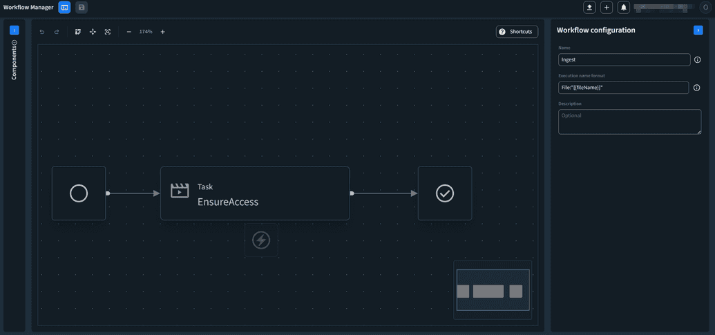
You can open the code editor by clicking Switch to code editing.
 To go back to the canvas editor, click Switch to canvas editing.

Canvas actions
When using the canvas editor, the user has access to multiple actions displayed on the canvas top bar.

- Undo/Redo – you can undo or redo an action.
- Switch layout orientation – you can switch the layout from horizontal to vertical and the other way around.
- Fit and center diagram – zooms the diagram to fit all of the components that are placed within it.
- 100% zoom – will default the zoom to 100%.
- Zoom out/in
- Shortcuts – displays a modal with a list of keyboard shortcuts that can be used in canvas editing mode.
Searching for components
- On the left side of the page, the Components section is displayed. This section is collapsable.
- Use the search bar to find components by name or expand and scroll through the available components.
Component Types
The following types of components can be used in a workflow definition:
- Media Tasks – Tasks that alter a media item in a specific way or that can transition a media item from one status to another.
- Media Triggers – System events that trigger Ingest workflows.
- Logical Components.
- Workflow Tasks – Tasks that are used to create dependencies between multiple workflows, used for more complex scenarios.
Adding, moving, and deleting components from the diagram
- Once you find the component that you want to use, drag and drop it on the canvas.
- The canvas displays the drop areas where you can place a component. This can be either:
- Before a component that is placed on the canvas.
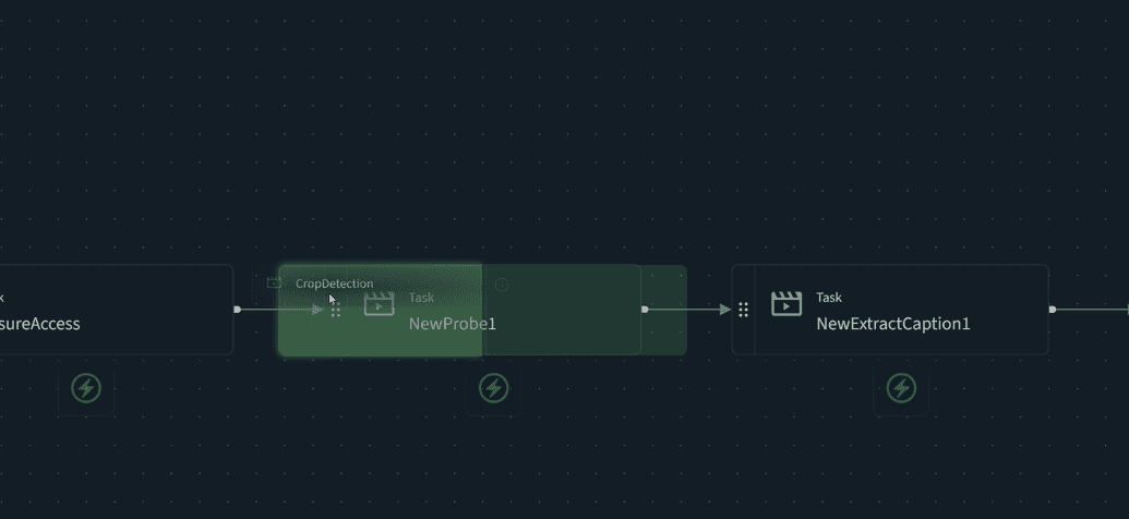
- After a component that is placed on the canvas.
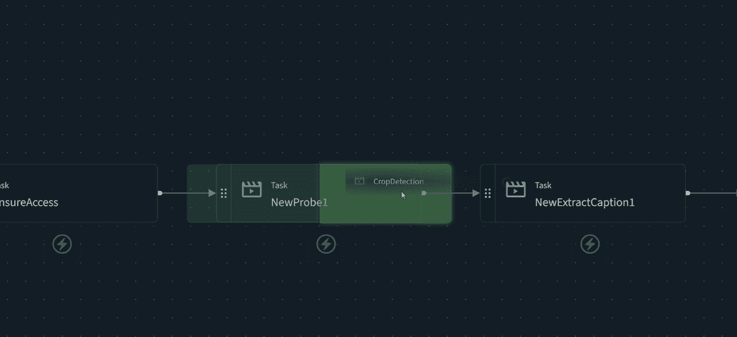
- On the failsafe path of a component that is placed on the canvas.
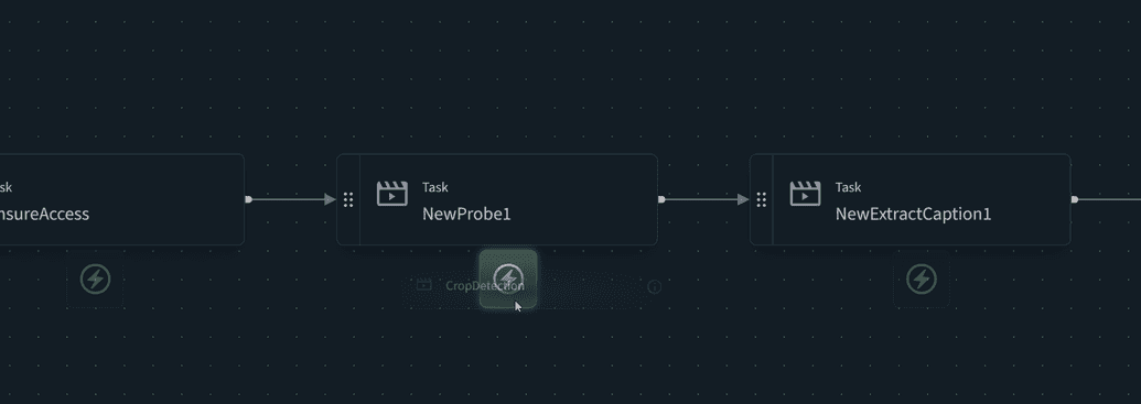
- If there is no drop point visible on the diagram when hovering, this means that a component can not be placed at that location.
- Before a component that is placed on the canvas.
- Once a component has been placed on the diagram, the component can be moved to another position by clicking on the drag handle.
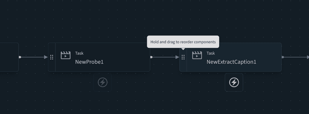
Moving complex components, such as Choice and Parallel steps and their branches might impact the structure of the diagram. This action is reversible using the Undo function.
- Once a component has been placed on the diagram, the component can be deleted by clicking on the Delete button. This action is reversible using the Undo function.
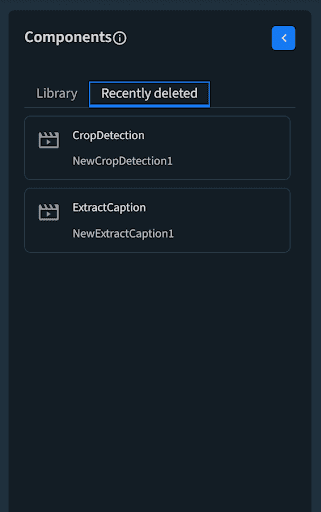
Any component that has been removed from the diagram by a user during their browsing session can be retrieved from the Recently deleted section using a drag & drop action. This will place back the component and its configuration on the specified position on the diagram.
Configuring components
Each component on the canvas can be configured from at least one point of view. To access a component configuration:
- Click on the component on the canvas.
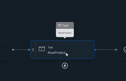
- The right sidebar will be loaded with the selected component’s configuration.
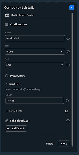
In the following section, we offer details about the types of configurations you might encounter during the process of building an Ignition workflow definition.
Inputs
Most tasks that are added to the canvas will have one or more inputs that will need to be configured.
To configure each input you have to:
- Check the input value type – each input will have a value associated with it, which is marked by a corresponding symbol.
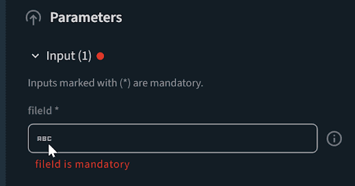
- Type in the input, using static values or outputs that are available from previous steps.
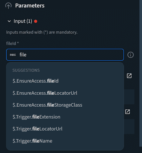
Note that all input fields support suggestions from the list of outputs of all previous steps.
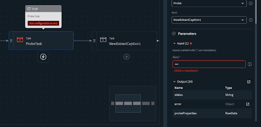
Any component that is missing configuration, such as missing an input value, will be marked as such on the diagram.
Outputs
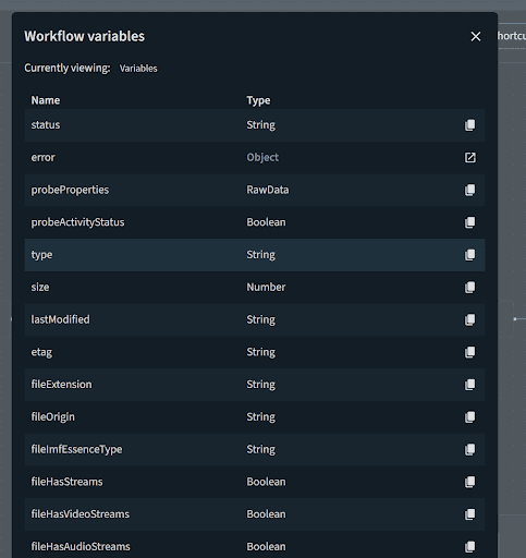
Each task can return one or more outputs during execution. Users are able to see what each Task can output, by expanding the Output section in the sidebar.
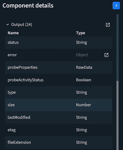
The list can be accessed in an expanded view as well by clicking on the Expand button.
Choice branches
Choice branches have the following structure:
- One or more conditional branches, with an editable conditional statement.
- A default choice branch, which will always be taken if no other condition is met. As such, it does not have an editable conditional statement.
To edit a conditional statement:
- Choose the conditional branch that will be edited and click on its name. A modal is displayed.

- Enter a name for the conditional branch so other users can understand what the branch does during executions of the workflow.
- Create a conditional statement using the builder that is available in the user interface.
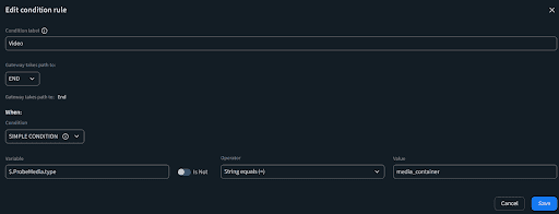
Besides editing conditional branches, you can also:
- Reorder branches in the sidebar using drag and drop:
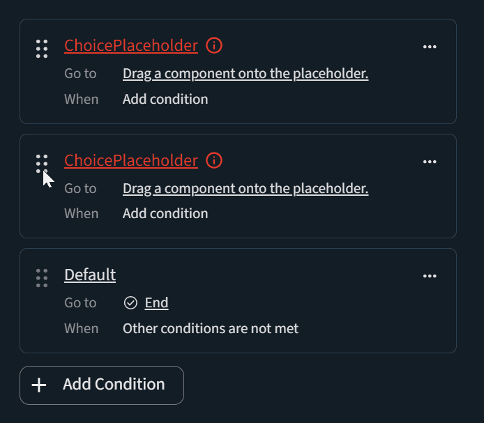
- Delete a branch using the context menu:
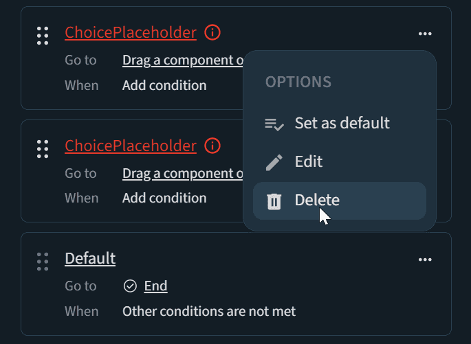
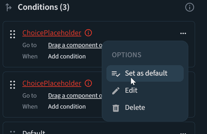
- Set a non-default branch as the default branch using the context menu. Nothe that this will clear any configuration that was made on the new default branch and transform the old default one into a not configured conditional branch.
Parallel branches
Parallel branches have the following structure:
- Two or more branches.
- A converging step where all parallel branches will merge.
All components placed on a Parallel step must converge in the converging step, either directly or indirectly.
To edit a parallel branch, you have to:
Place the first component on the branch, starting with replacing the placeholder value.
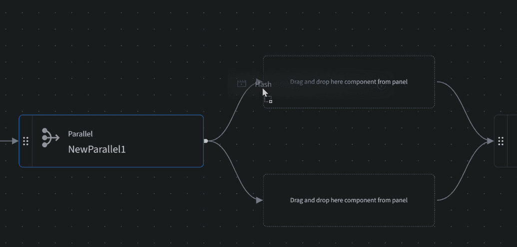
Continue placing other components on the branch, either before or after the first component.
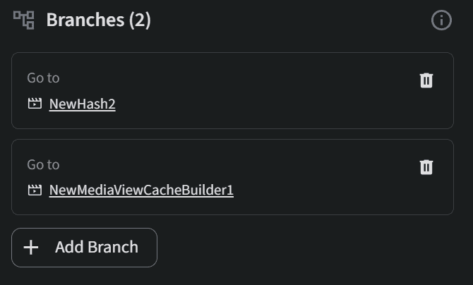
The parallel branches will be displayed in the Component details section, marked by the first step in each branch. To add a new branch, click +Add Branch.
